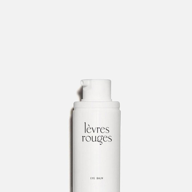
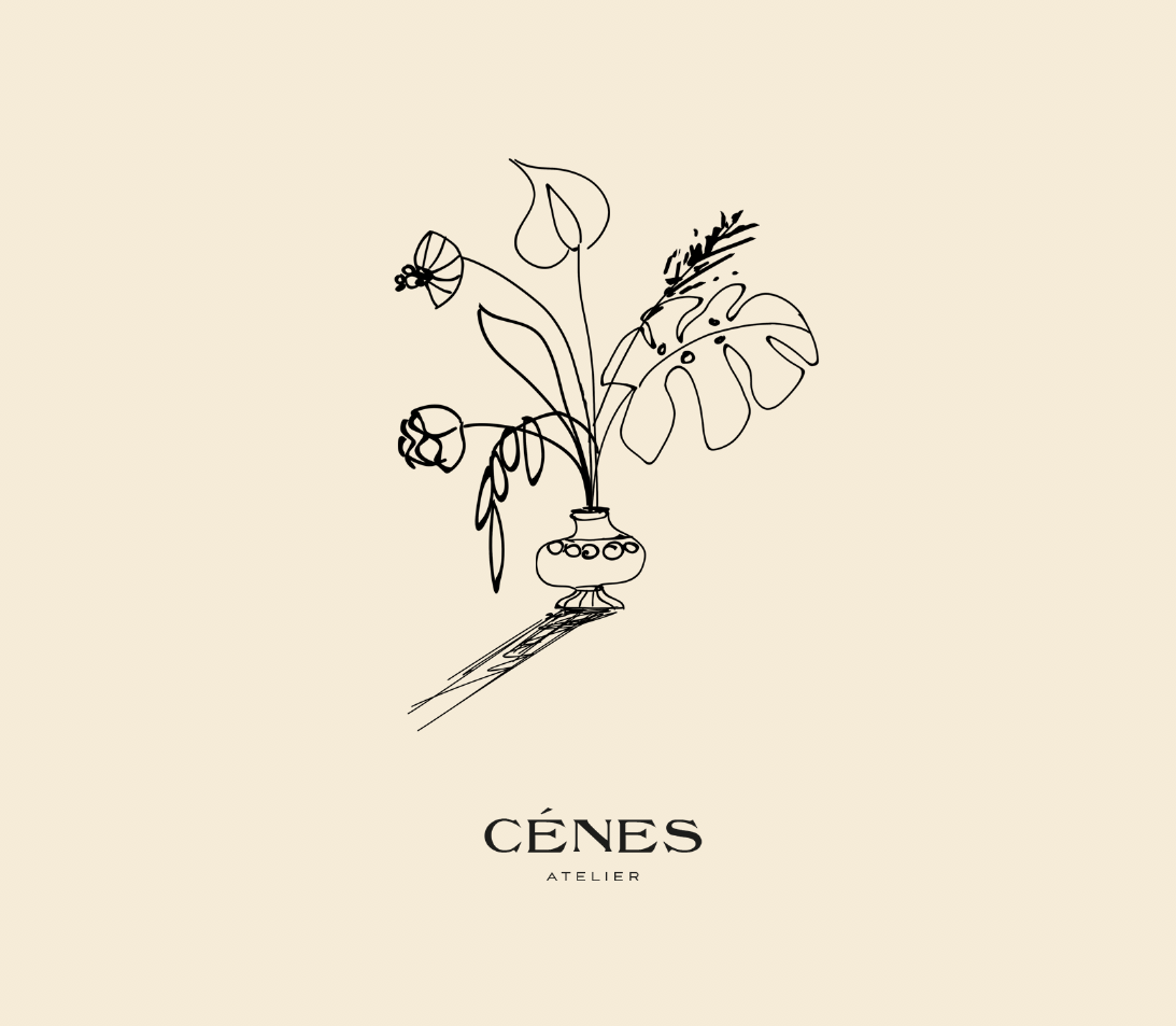
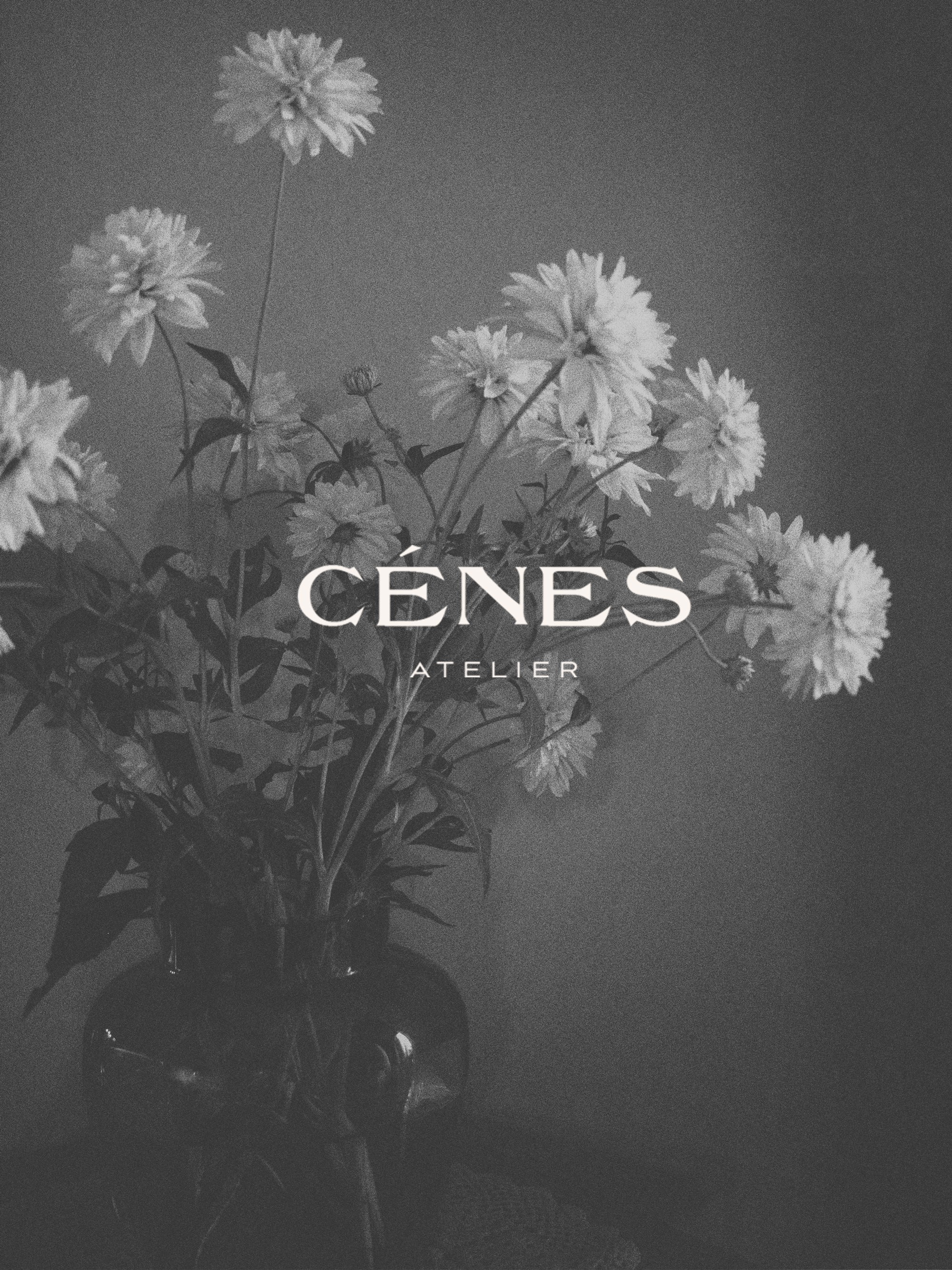
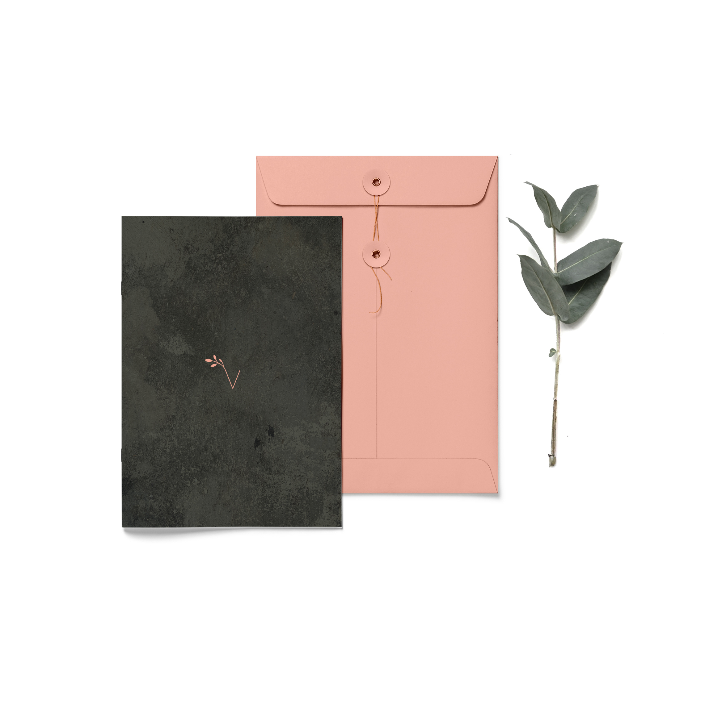
Whoa it has been seven months since my last blog post and so many things has happened I can not keep up. I’ve met so many great people, I worked on great projects which I am hoping to share on my website soon. For now this is a sneak peak of one of my projects I am currently working on which I can not resist to put up straight away. i’ve changed the name as I can to reveal the name as yet but it’s a cosmetics brand design identity where we create a customised lettering for the logo and use some great typography for the packaging. The logo is my favourite, it’s romantic yet minimal and clean, modern and chic. I included a moodboard and few simple mock ups with the logo. I just can’t stop looking at this…I love it and I hope you will too.
Latest Work: Cénes
Cénes is a premade brand identity design concept which has been inspired by French elegance, antique vibes and gallery aesthetics. It uses unique illustration, bold type and moody images to bring strong visual representation and character into the brand’s overall feel. This branding would be great for a flower shop, property brand, product brand, hair salon, gallery, however the list is endless and we can help to fit any line of business. This package is fully customisable to carry your business name and details. All images are included or we can replaced them with your own. Fin out more about the process in the shop description here.
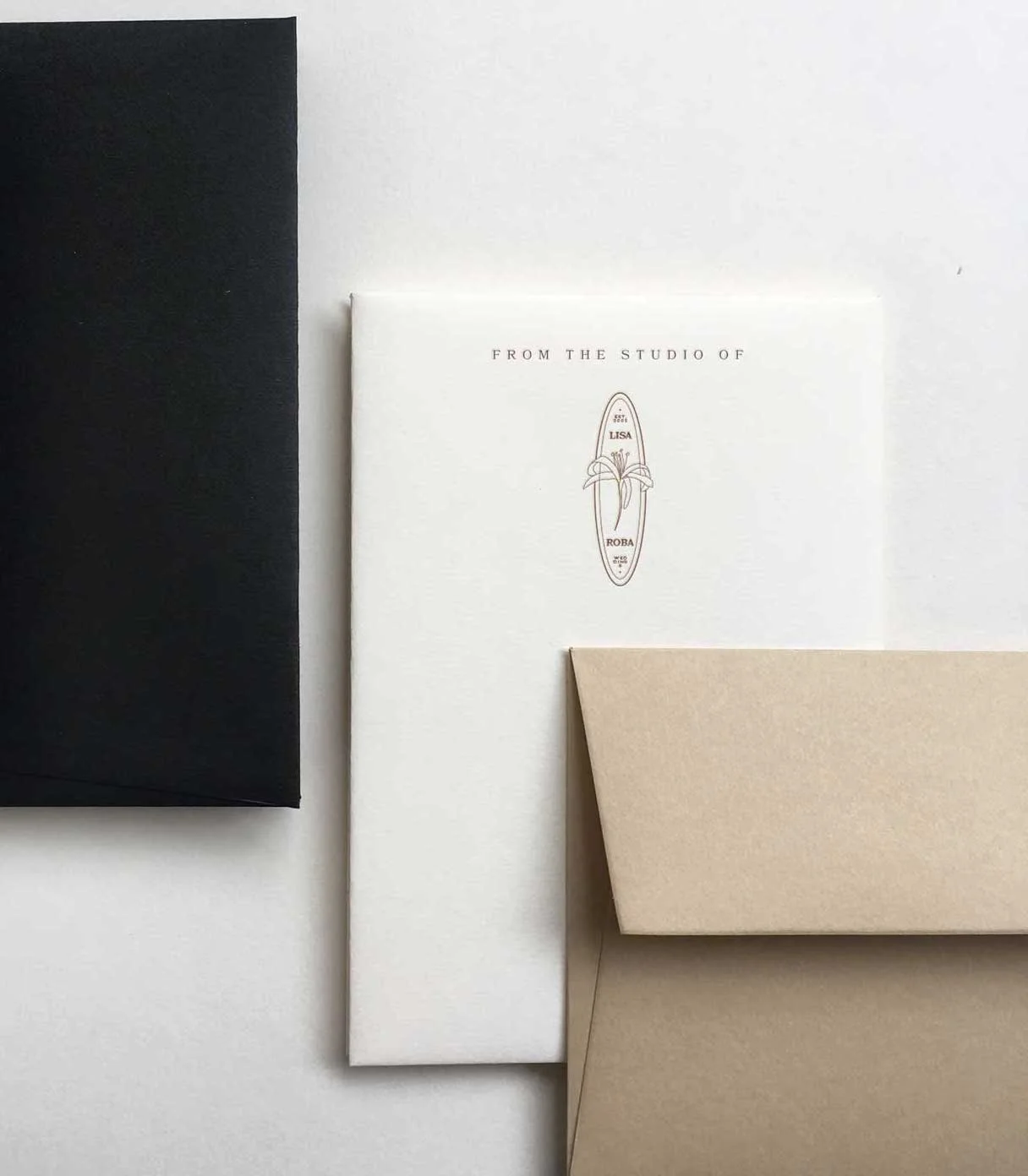
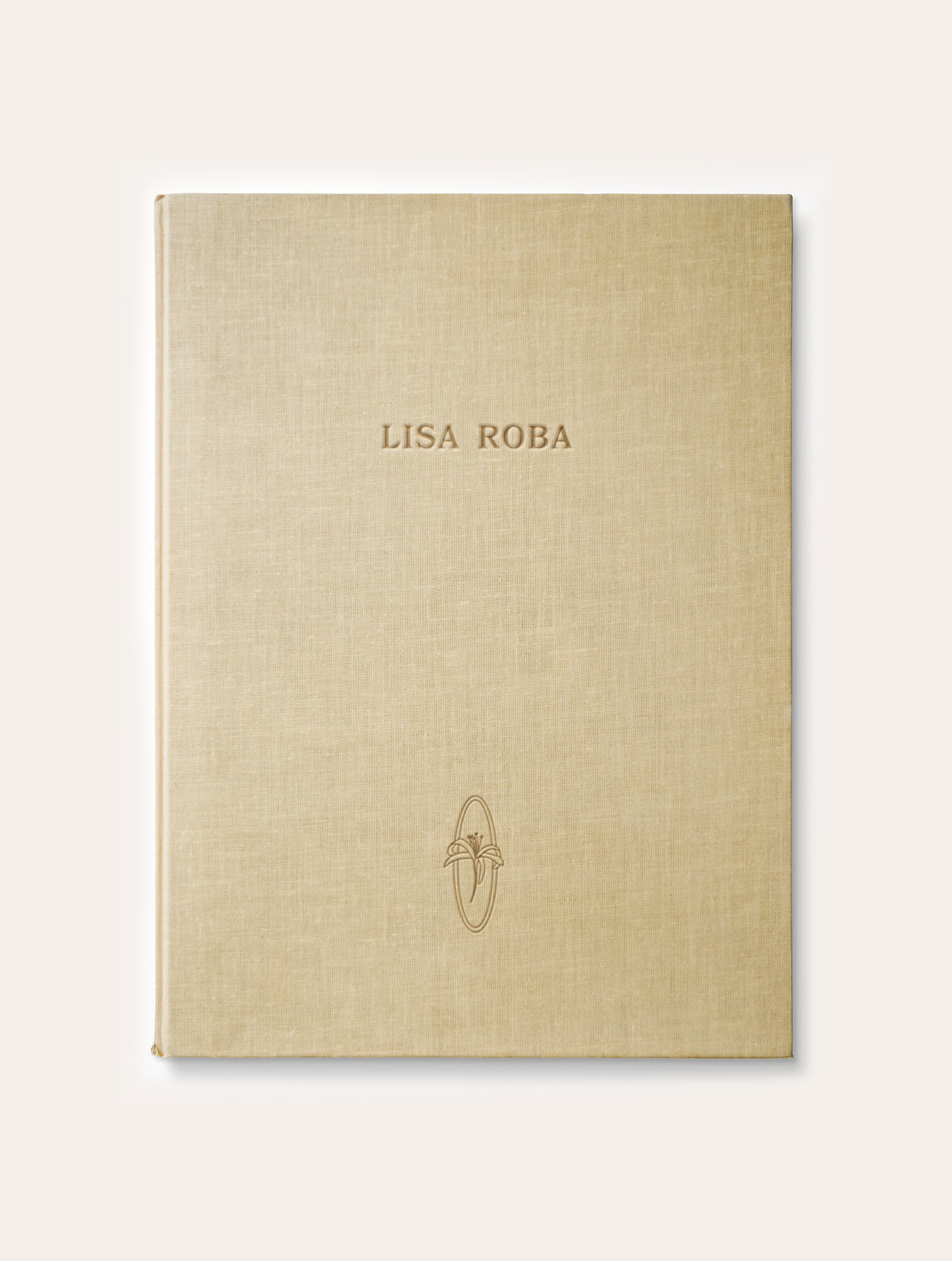
Latest Work: Lisa Roba
Lisa Roba is a wedding stylist who wanted to create a simple and minimal brand identity that would reflect her style and aesthetics. We created a fresh wordmark and a noble symbol in a style of Art Deco with a flowery illustration. Here are little snippets of the final product design and the inspiration for the brand from @megganroussel, kamperett.com and pinterest.
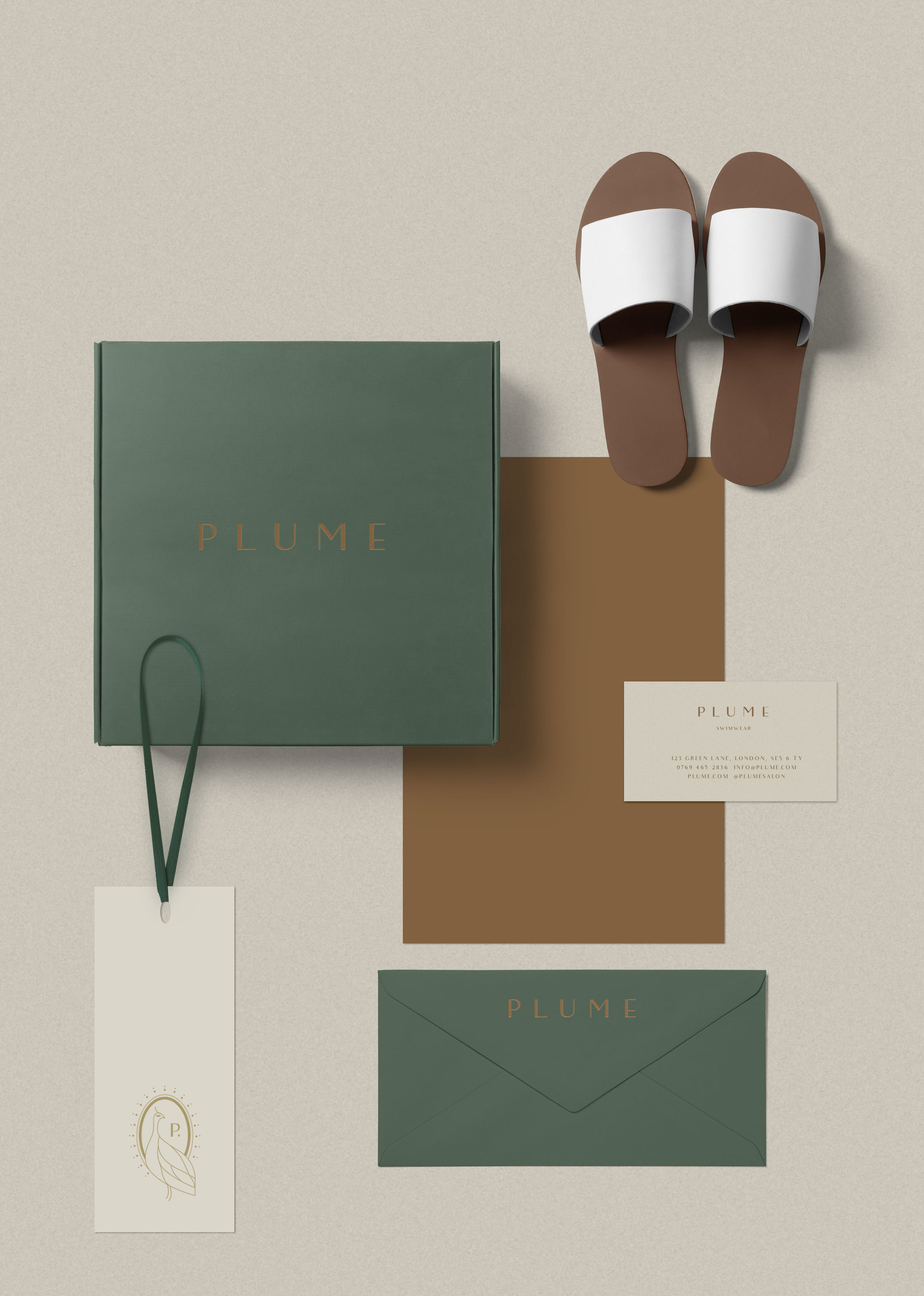
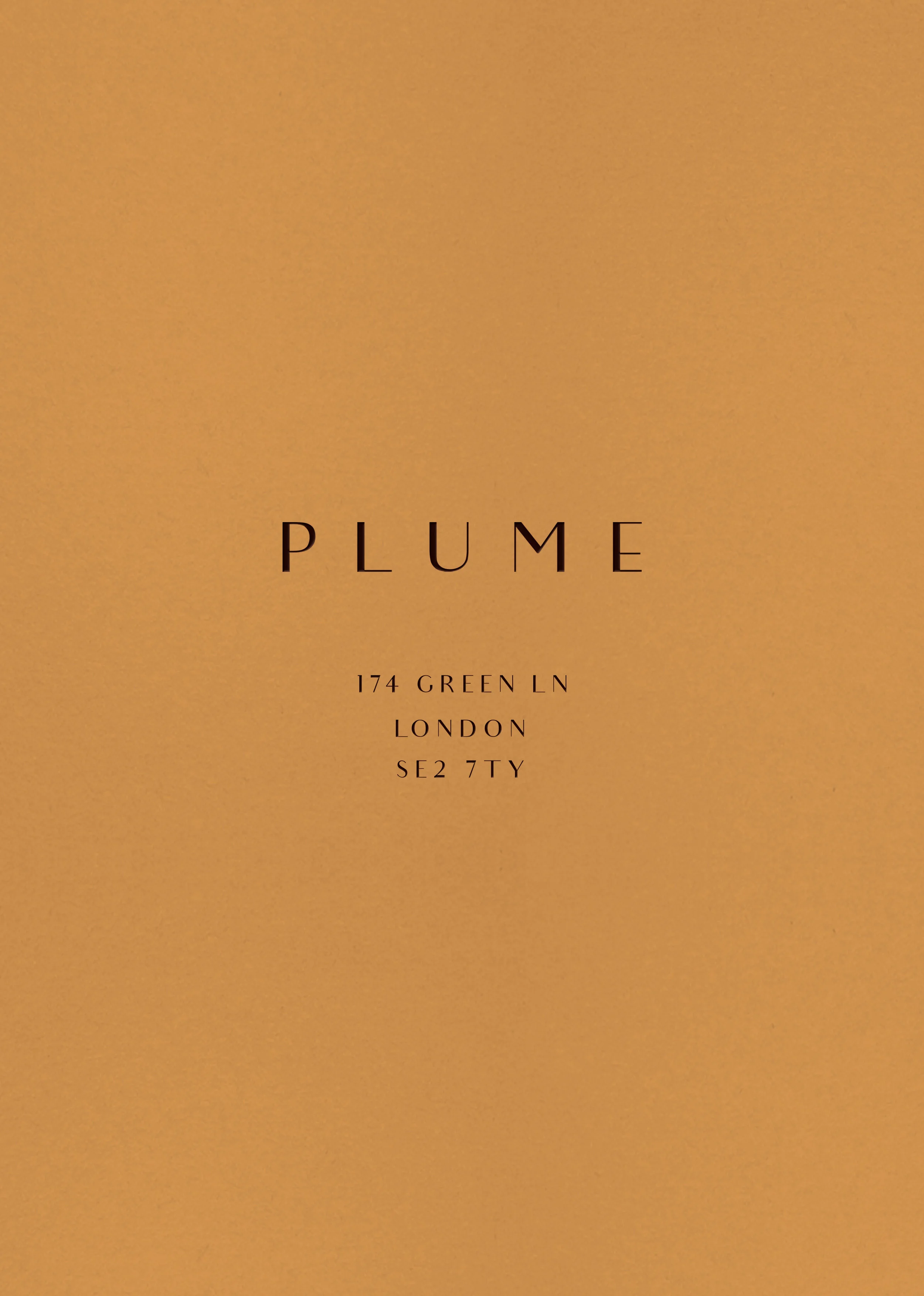
Latest Work: Plume
Plume brand identity design is a premade branding package that has been created in the early summer evenings. It's rich pantones are reflection of the golden summer sun and earthy green fields. The overall style is minimal but still warm and approachable. An elegant typography and supportive graphics add a touch of magic and Art Deco glam.
This branding would make a great fashion label or would work for a stylist or a hair or spa salon.
Find out how we customise this branding to suit your needs and more info here.
Weekend Snapshots -No.2
May in England is great, we get two days of bank holidays which always fall on Monday and so we get two juicy long weekends. We usually go to the beach if the weather allows and this year was no different. The air was salty, the sun warm and the water sparkly.
Latest Work: The Ivy Clinic Brand Identity Design
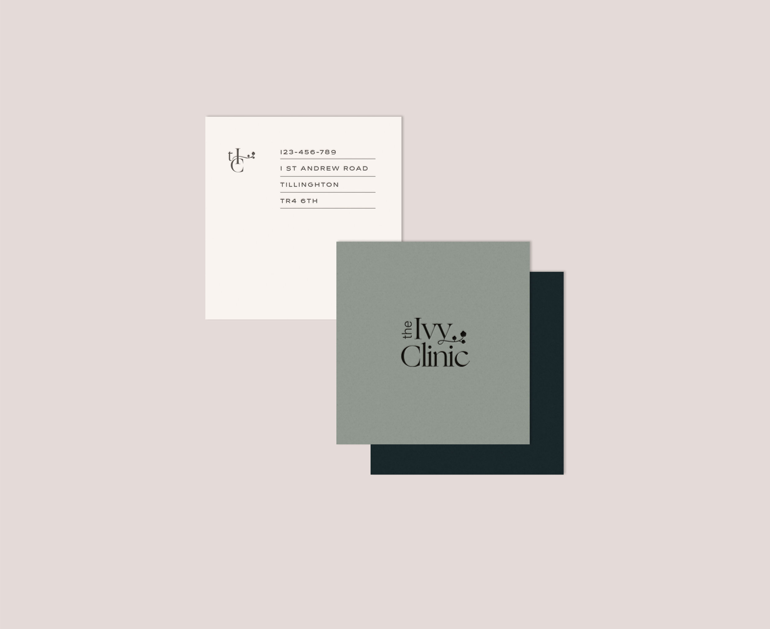
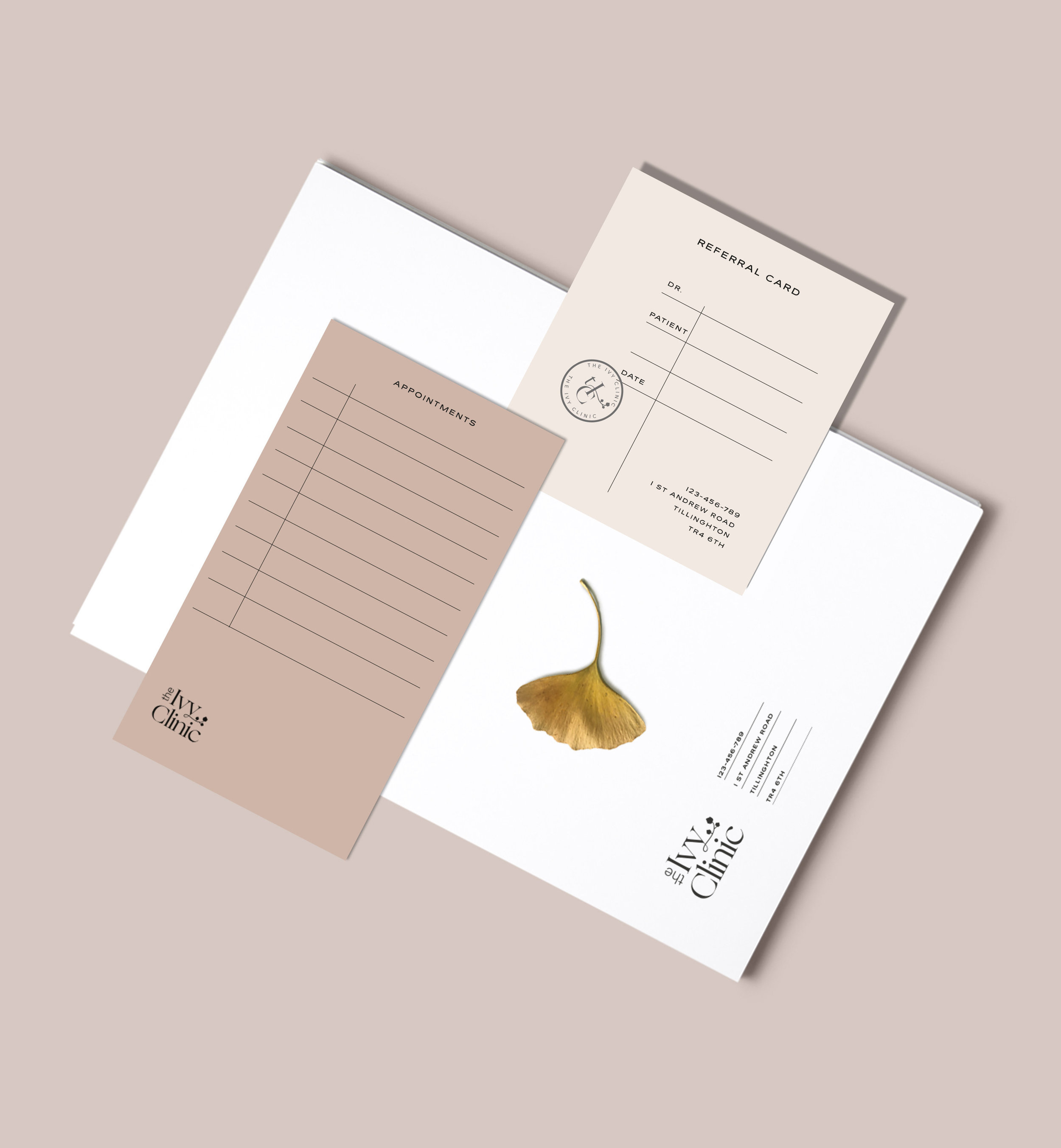
I am super excited to introduce the newest addition into the portfolio- A brand identity concept for an all inclusive beauty clinic that wanted to do things differently. The objective was to create a brand that's minimal to reflect the purity of the business' nature but also friendly and welcoming at the same time. We all know the often portrayed sterile clinic aesthetics that no matter how we look at it brings an unwelcome memories of our visit to the dentist. Well, that's exactly what the folks at Ivy Clinic wanted to avoid and change. They wanted to move with times and show their brand as modern, fashionable and above all warm and inviting. I hope you enjoy this dreamy palette and minimal aesthetics this branding has to offer.
xoxo
Summer Beauty Favourites
Recently I discovered few really cool beauty blogs and have been so inspired I thought I really want to do my own beauty post. I am showing my must haves and recently discovered beauty products but it was also the idea of taking cool pictures and have fun with the shoot that inspired me to write this. The new Kinfolk issue is wrapped in a deep earthy red which made the perfect combo with the Glossier pink packaging I recently had delivered and I thought this would make the perfect mood and setting for a fresh spring/summer beauty edit. The photos are shot in an afternoon sun on a pinkish background which was a great combination for the golden oils, white packaging and brown bottles. I hope you enjoy this post as much as I enjoyed shooting it.
xoxo
OUAI Hair Oil - this one is a life saver! I’ve been so frustrated with my hair lately I was going mad. The frizz would not go away and I wouldn’t go out unless wearing a ponytail. This oil smooths out my hair making it look all the same length, soft and sleek. Honestly I have no idea how this is possible, but don’t care coz my hair is back yo!
Laura Mercier - tinted moisturiser. I think the name says it all. It’s a hydrating moisturiser with light coverage and plenty of glow. Sometimes it might feel a little too glowy but so far I like it. Although I got the lightest shade I feel this one is more for the warm type gals. I am cool type ( yes, cool) so I can do with a rosy undertone and this one is more yellow. Still though a great thing for the summer.
Glossier - eeek! I must admit I got this one because I like their aesthetics and marketing. For a research purposes I had to have it so you can say it's mixing business with pleasure. However I am still questioning wether the products are worth the hype.
I got the Glossier Phase 2 set as I was in need for a concealer and of course, I was always going to find purpose for the rest of the products.
Generation G lipstick-I ordered the like shade however the one I got looks more like the crush. I can't think how to describe the smell of the lipstick but it's not very nice.
The Boy Brow is cool, gets your brow to stay in shape adding a bit of a tint.
The concealer feels a bit dry and the application is not the easiest. I had been using liquid concealers until now so perhaps I have to get use to a new way.
Oh and this OUAI comes in 45ml pump container but honestly guys look at it! It’s seems there is so much more than that. At least that’s what I like to think…. This one is a summer winner for me!
MALĀKO is a heart situation. I had the honour to work with the owner Kanchalika to design this super cool eco and design conscious, skincare brand. It was even featured in the Walpaper eeek!
Inspired by the Thai culture and rituals the jars are packed with high grade natural goodness that not only soothes the body but helps to reconnect to your mind and soul… This goes beyond and it’s real. And eveytime I use it I can not believe something like this can be made. The smell and texture is divine and I can not put it down. Check them out at @malako.skincare
Note the drop....so dramatic :)
Recycling ready
Latest Work: Hair2Stay-Brand Identity Design Concept
Whoa, I cannot believe it's been so long since my last post. It's been super busy here at LOOLAA and I am excited I finally started gathering all my work into a shareable formats so I can share with you loads more often.
I am super excited to introduce this beauty brand identity concept for a hair salon. This concept happened during a brainstorm session for a new brand identity for my dear friend Sam Sriumpai and her mum's hair salon. Sam and I really loved this concept however we thought something more traditional and cultural would suit her mum's brand a bit more. (coming into my portfolio soon)
I decided to share this concept as it's super edgy while still trustworthy and comforting which was the objective of the brief. The idea for this concept has been inspired by the chinesse aesthetics. Long elegant lines idea taken from chopstics and turned into friendly floating shapes portraing hair from a different perspective. The line forms together with patterns bring harmony, wisdom and comforting feel to the brand's character.
And so it shall live here in my little cyber space.
Getting back to work
If you're like me you feel like you need another holiday from holiday as soon as you arrive home. I've just been to Italy and I usually need a week to get into the holiday mood, turning off the thinking switch and get into the vibes of nothing doing. So when you actually do reach the chilling state of mind it's time to go home. Of course there is one thing I always come home with-it's the lazy daydreaming attitude. Although the last days have been crazy busy here at LOOLAA I am still trying to reset the creative button. Having my thoughts flow naturally rather than burning myself out.
Today I woke up relaxed. I didn't rush straight in front of the screen, instead I took my time enjoying my morning flow feeling balanced and connected. I tricked my mind into thinking there was nothing to do or achieve today. Slowly sipping my morning coffee flipping through the new issue of Vogue the inspiration and creative juices was soon to come.
Being able to stop and listen and taking a different approach to my routine I opened myself to other possibilities I would have otherwise close the door to. Also I discovered an amazing artist and photographer Marton Perlaki. Hungarian born now living in NY he brings the milky-hues together with still life, the weird and the wonderful working in perfect harmony. Check him out. He is definitely someone I will be coming back to for more inspiration.
The first below artwork is indirect copy of his fashion photography for V by Very at the Sept Voque issue. Followed by more photographs by Marton Perlaki.
Feed the urge
I started working on a project I've been waiting for since I started as a freelance designer. Not only I am screaming on the inside as this is my dream job, I am super excited feeling my knees shaking nervously as I really want to nail this one.
I am super pumped about it, it's something Where I will really go out of my boundaries. From the day one I've been learning so much, discovering new styles and combination, ways of expression, thoughts and process and definitely feeling more than ever that design is about the feeling it portrays rather than looking just pretty.
During my research phase for this new project I strangely had the urge to draw. Draw something that comes straight from the inside, unfinished giving room to breathe. So here are some randoms.
Summer Sale 17
And so it begins! My first sale campaign! Celebrating the sun, sea, skirts and sangria bringing you the joy of summer with 20% off on exclusive premade branding packages and instant downloads. With things and stress dying a little over the summer season it might be the perfect time to get your branding sorted and be ready when things pick up again.
Take a look at our Etsy page where you can find even more designs.
Enjoy x
New custom Identity - Sneak Peak
It's been ages since I last posted here and no I haven't been in Amsterdam this whole time, but I can not wait to share the snaps of our wicked trip.
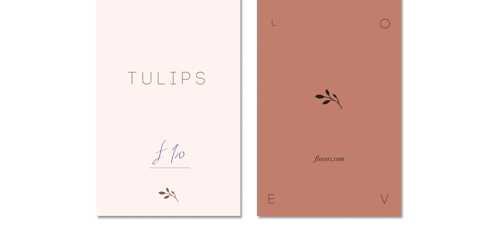
It's been quite busy here at Loolaa Designs in the past few weeks, working on some exciting projects. One of them been a custom brand identity for a flower shop and I just could not wait till it's finished and had to share with you a little sneak peak now. It's just few snaps of a brand that's very delicate and elegant. It's earthy colours and choice of humbled font give sense of calm and friendliness portraying the love of flowers and their mighty language. Enjoy x
Packing for Amsterdam
If you've never been to Amsterdam I say book your ticket right now. If you live in Europe, especially Netherlands surrounding countries it's dead easy to fly over for just a long weekend which is enough to get to know the main sites of this city.
This is going to be my second time in Amsterdam and I can not wait to have a cone of chips topped with mayonnaise in my hand. Yep, that's right the Dutch know how to roll, although this is a pretty common snack in few eu countries.
Amsterdam is the only city I can actually see myself living apart from London. It's probably because it feels incredibly bohemian, artistic and liberating. the relaxed atmosphere, the high sealing modern art nouveau style bakeries would get me up every morning to get my coffee and read the newspaper. All of a sudden you feel inspired and interested in everything.
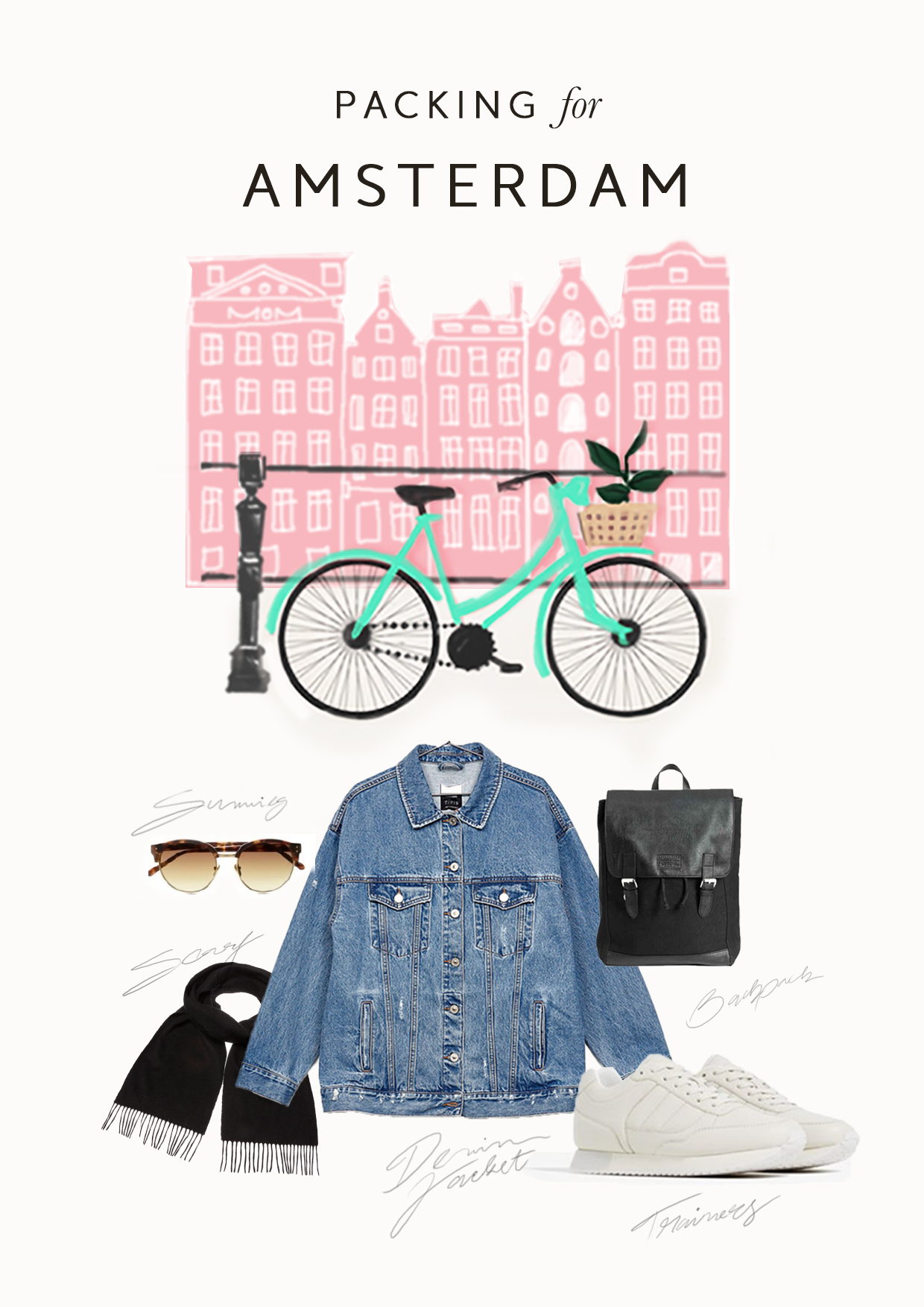
I consider myself to be a very much a Zara and H&M girl and so that's what's coming with me. My white Zara trainers which I had for the past two years and can not image anything more comfy. My black H&M backpack, Bershka denim jacket which I recently purchased and can not be happier, sunnies and yes a scarf. While typing this post I am in bed, loading up with vitamins trying to get better as I have massive cold. We're leaving tomorrow and I can not imagine this will go away but ain't stopping me! Amsterdam here I come!
Tropical Pattern Design
Seeing all of the beautiful tropical, leafy patterns all over Pinterest had me itching to design my own pattern for a while. Although it took me longer than I expected I am super happy with it. I made two versions and can not decide which one I am in love more. The first one is bold, energetic and fresh but the second one has a taste for the elegant, it's quirky and therefore different and different is good. I totally adore the two parrots I added to the cover page, but I felt like there is no space for them in the actual patter.
Check out the patterns below and let me know what do you think. Which one of the two does it for you? And what can you see this pattern used for? Is it branding, business cards, wallpaper, cushion or perhaps as a t-shirt print? Let me know in the comments. Mwah
Weekend Snaps - O1
This weekend was kind of special. Not because we did anything super exclusive but exactly the opposite. We did the regular things we like doing but this time it was different because I lived and enjoyed every moment by being in a present. Every day goes pass and you live it through being on autopilot, missing the little moments and you think that's normal, that's just how things are, but they don't have to be.
In the morning we got up and for the first time ever did 20 mins mindfulness yoga practise which for us doing on the weekend is practically impossible. Weekends are for chilling and why do anything if you don't have to? Well, although is't hard to admit, committing to some kind of routine and being able to discipline yourself is of course hard and so if achieved you just feel on top of the world and like got your life together.... (grin). So this morning practise just set us for the day and made us feel alive.
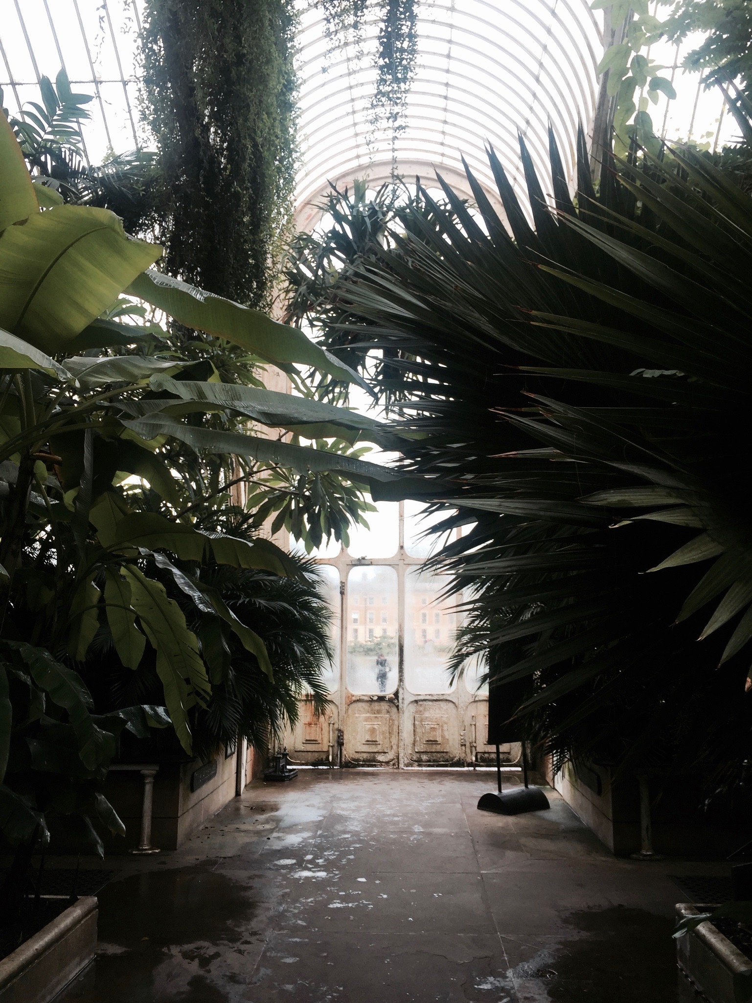
We went to our favourite place in the whole world - Kew Gardens. Royal botanic gardens in London where we not only had our first date with my bf but this place is so close to our hearts that if I ever was going to get married it would be here. The tropical plants in their palm houses are the most stunning and I have so many pics that I am thinking of creating blog series just featuring those.
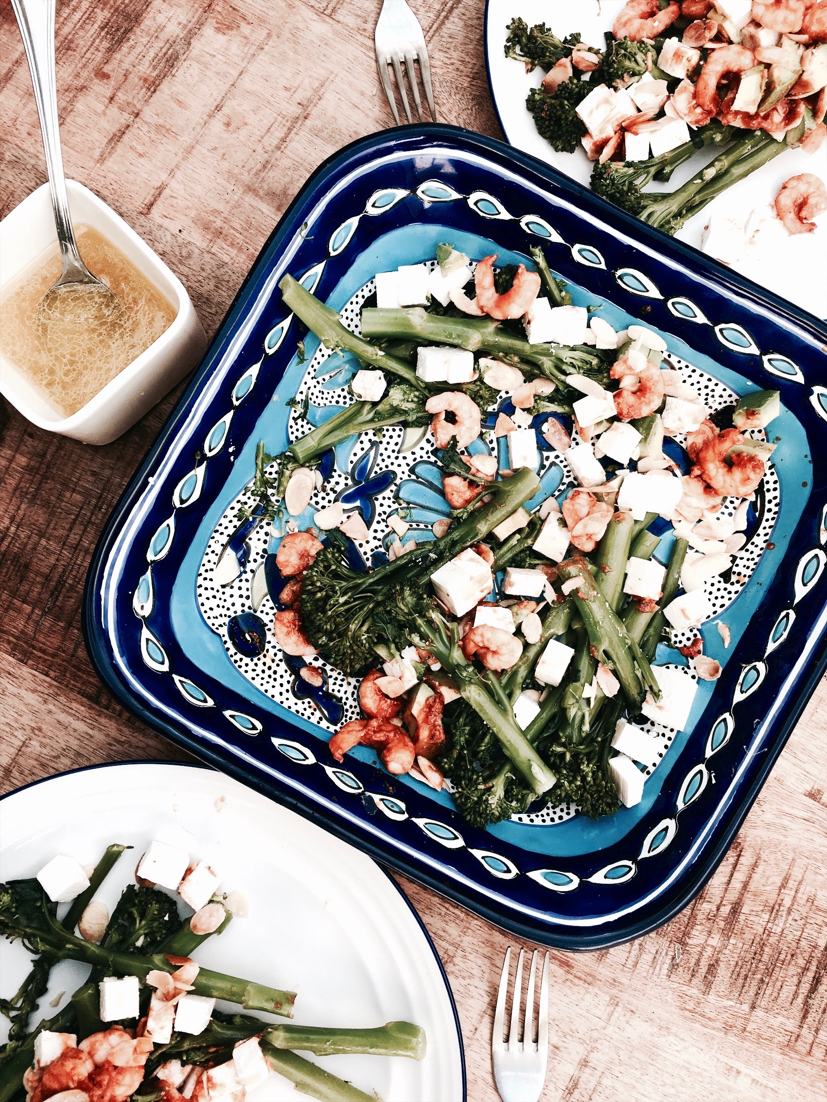
We cooked great healthy meals, again great achievement since we use to eat anything and everything on the weekend but creating restrains for some odd reason just felt really good.
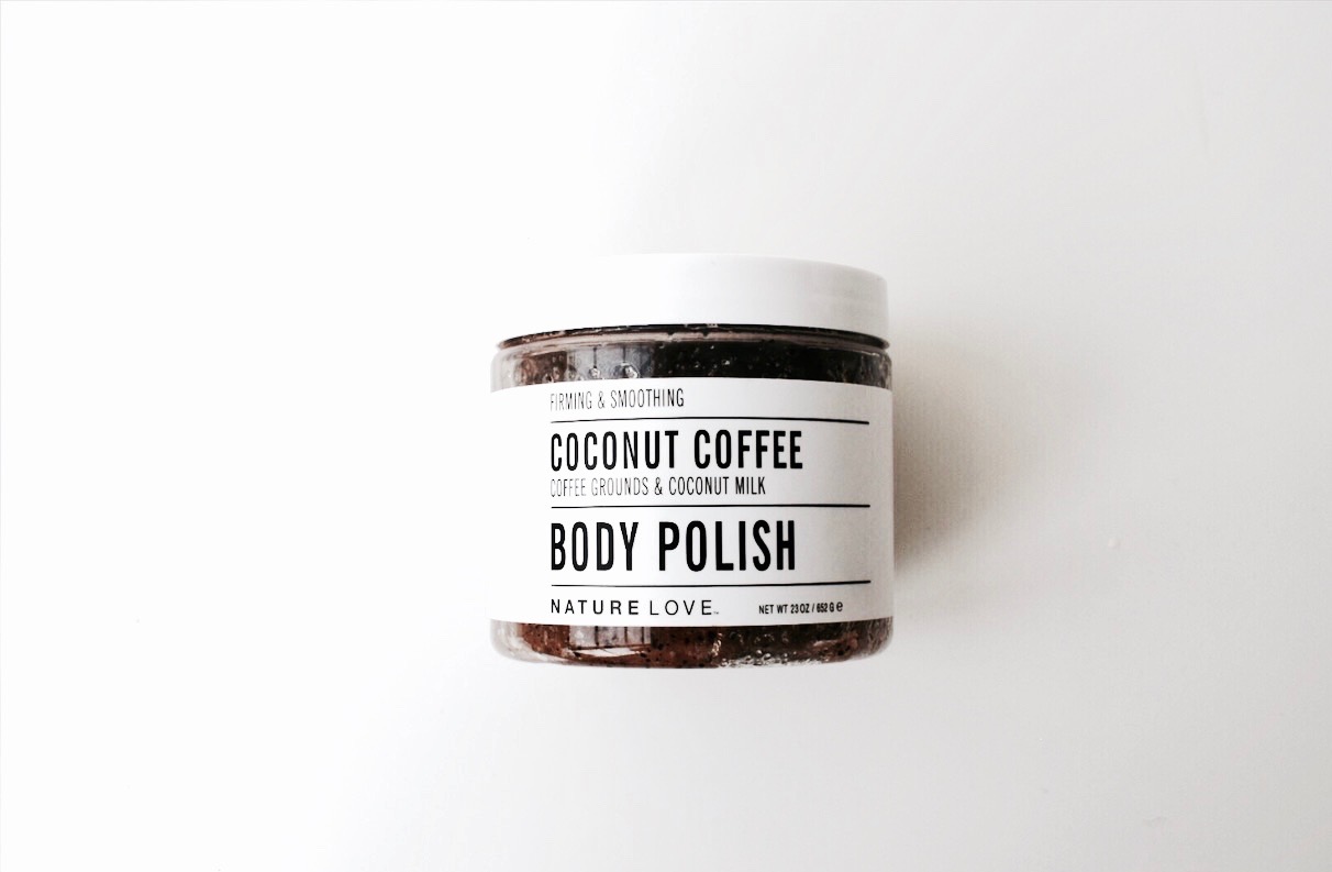
I even felt so good about myself it sparked the crave to pamper and nourish my body. I can not describe how yummy this coconut coffee body polish from NatureLove is. I am seriously considering having a love affair with this product. I am that in love.
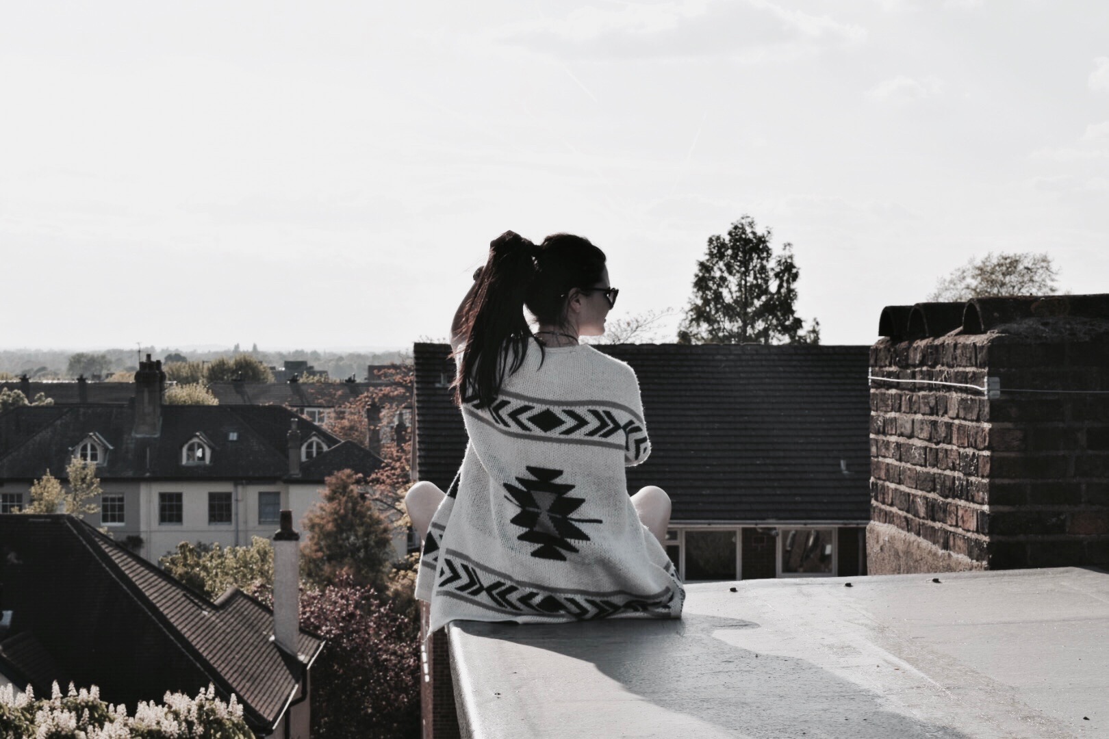
The weekend could have not end better than just us chilling on our roof being kissed by the unexpected sun shine followed by an amazing sunset. It could have not been a better weekend.
Angry universe
With everything that's going on these days with America and the rest of the world makes one wonder how did we get to this point? How did we manage to slowly start destroying ourselves?
Therma+Spa - Premade Branding Package
I love the rawness, simplicity and minimalist feel to this branding. It's clean and edgy with texture created from tropical green pattern. I can not be more excited about it. It's quirky and fashionable with a hint of Art Deco/Secese. I love the feel of the gift card which is a little unconventional but elegant, a little special and honest at the same time. There are countless possibilities how the pattern can be used, it would be awesome as a wallpaper in a hair salon or wrapping paper from a flower shop.
Not like most of my premade branding package this package is exclusive and will only be sold once. So hurry once it's gone it's gone.
You know that I always add a bit of custom character to my premade packages to reflect what you stand for and the story of your brand. The same goes for Therma + Spa. Although this branding is about spa and beauty and the pictogram reflects the idea of thermal springs, the branding would perfectly fit to a other line of businesses like flower shop, fashion brand/boutique, cosmetic brand, hair salon, etc. The logo can be easily customised with an image of your brand's symbol.
Find more info about the process here: THERMA+SPA
So I hope you like and if you have any questions big or small pls pls just give me a yell!
Lxx
Badseed Studio -Branding
Hi Friends, I wanted to share with you what happens when you decide to brand your business with our premade branding packages and let us customise it for you!
I am super excited about this badass branding. Badseed is a creative studio handcrafting concrete home and decor which is out of this world. Moira, the owner, cleverly chose slate grey colour to customise her Violet pre-made branding package, to reflect the colour of her main material. We added geometric elements to reflect the look and feel of her products. I totally dig the quirkiness and almost dark mysterious feel accompanied by the moody hand-drawn flowers. It’s just goes insanely well with the studio’s name and the “moodyness” of the brand.
Check out some more premade branding packages in my shop or if you have already chosen yours check out how to customise your premade branding package.
Random Art
Hi lovelies, So it's Monday huh? Harsh....Hang in there, Christmas is here in no time.
I thought I'd start sharing a little snippets of my work process in a short blog posts "Random Art". These little articles will really just be art that happened along the way or are in progress. Loads of them will be concepts that will remain unfinished so if ya like any of it and would like to explore it more for your own project give me a holla.
Starting with this little graphics of snakes for the chillest customer I've ever worked with FlatFrances. I had the pleasure to design collection of patterns for her and this one is one of them. There is one problem though, i like it as it is on it's own and not in pattern.....decisions, decisions, decisions....
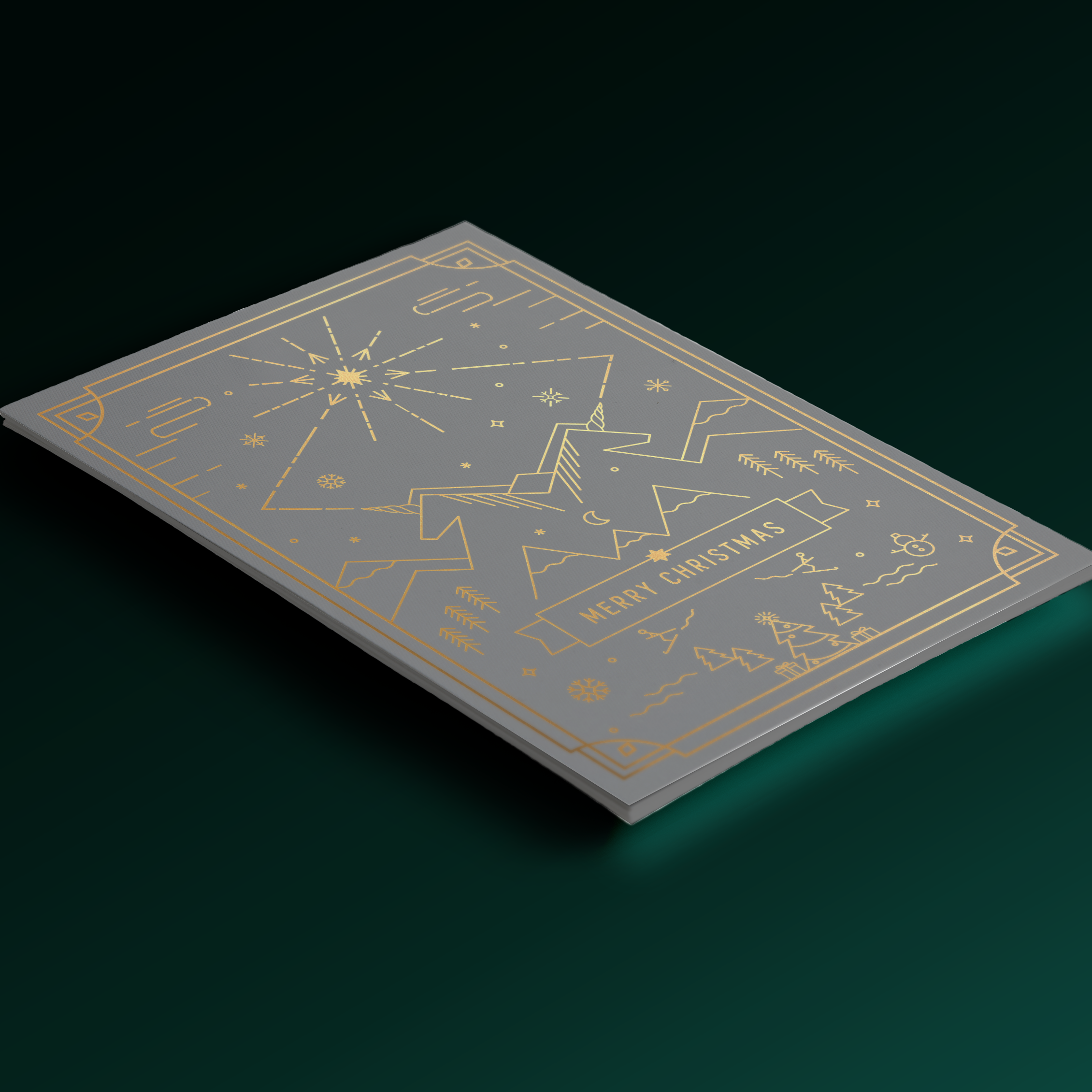
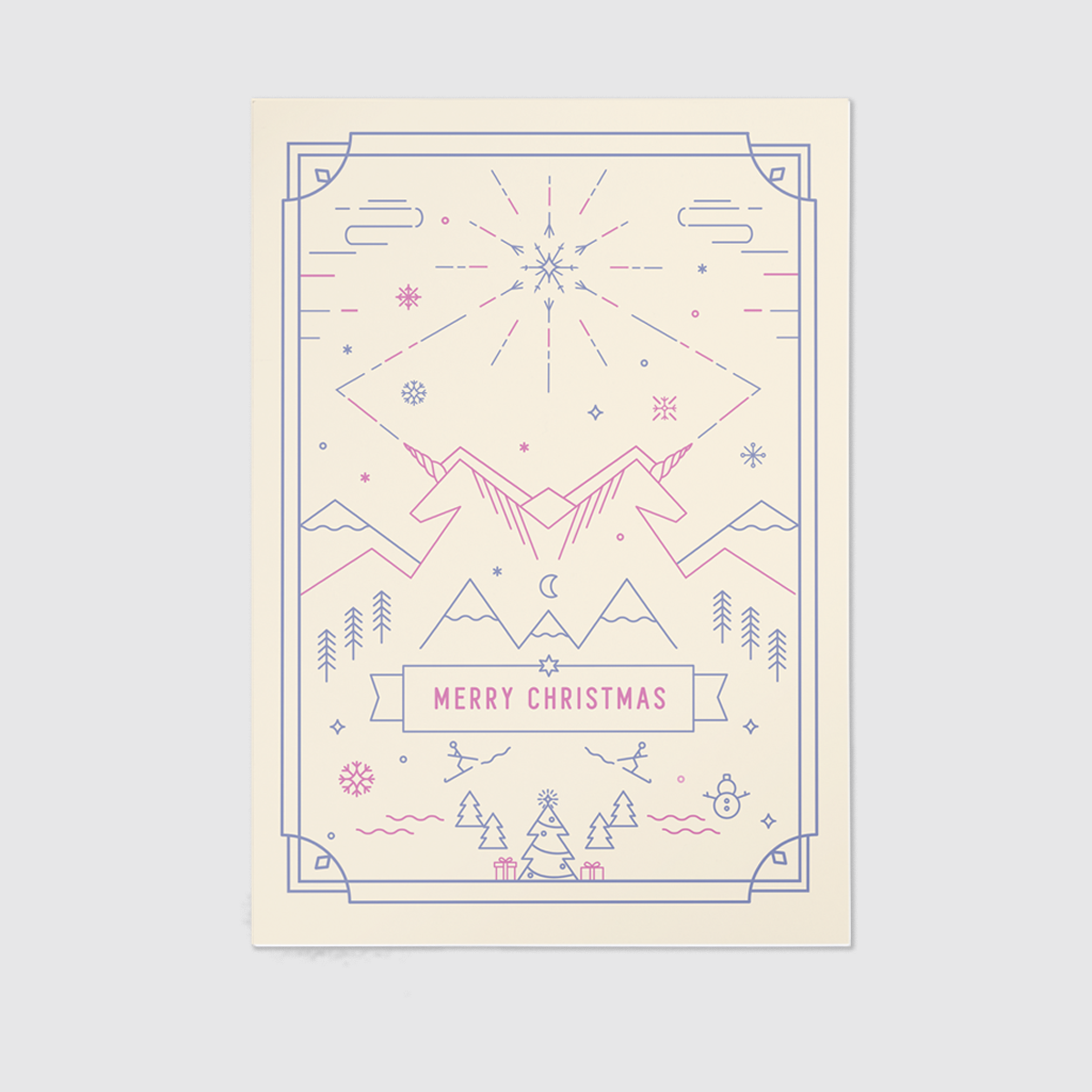
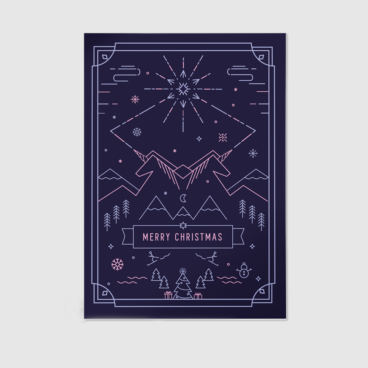
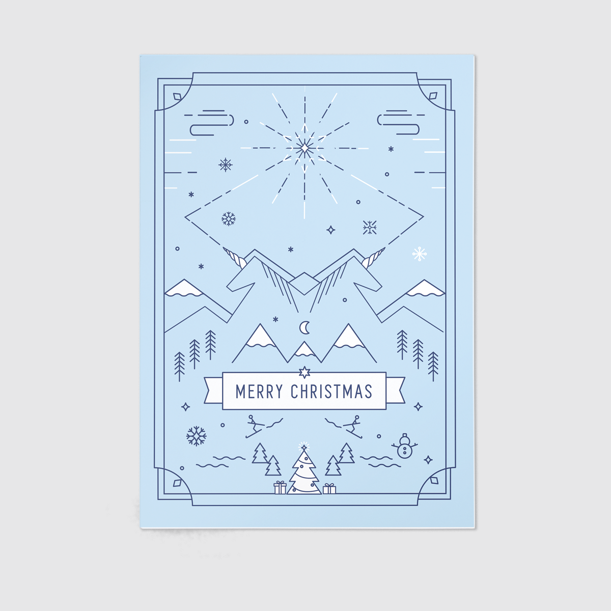
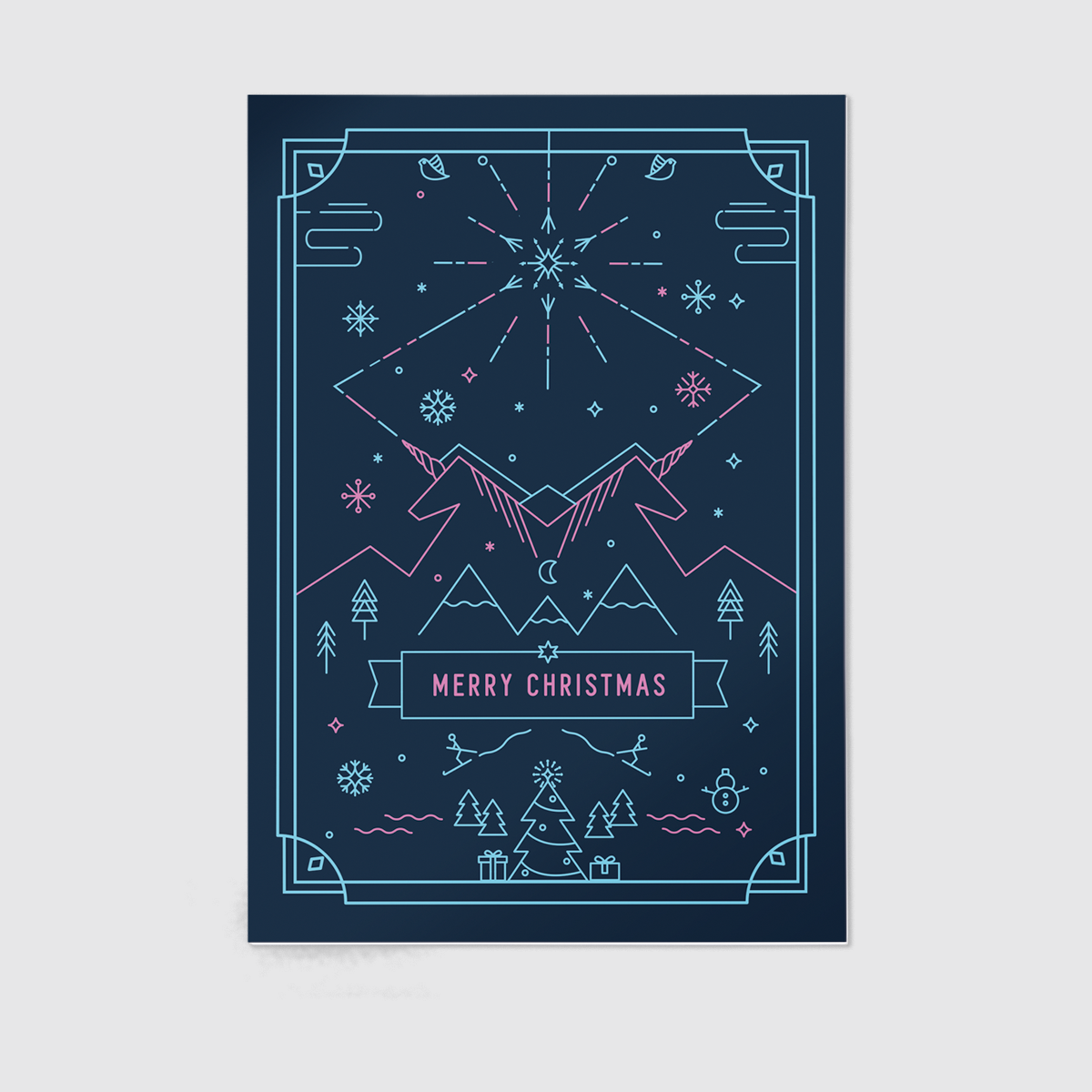
Unicorn Christmas Card
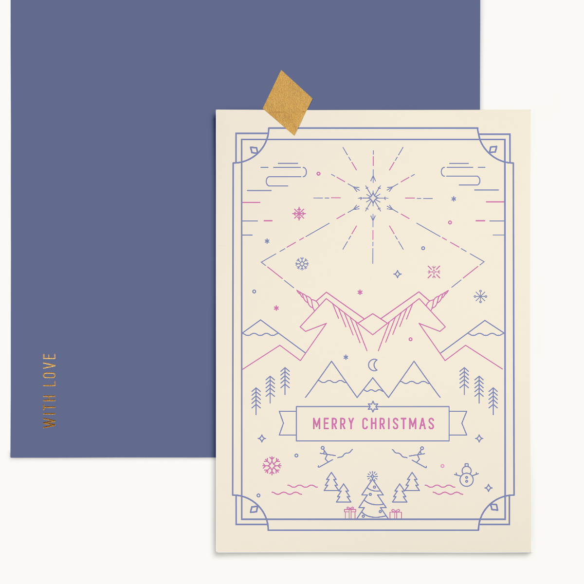
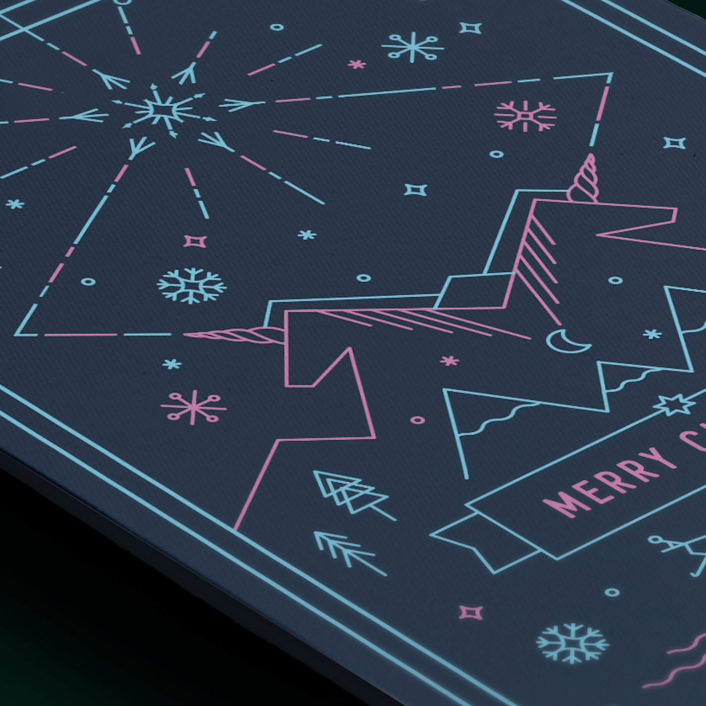
I thought by designing something Christmassy will help me get into the Christmas spirit but I can not say it worked. Perhaps because this card is a bit unconventional. Yes of course because it has a unicorn in it!! Well this designed is a totally the creation of my bored mind when lying on a couch fighting the flu....and being on medication. Yeah the design makes sense now huh? Well keeping this post short since is Black Friday and no one has time to read boring blurs I am offering this design as a set of 5 all in different colours to purchase from my shop for a discounted price. That's all my friends, so nod, shop and be merry.
Loolaa x


